The evolving landscape of toilet design and public perception
As reported here, in Wim Wenders’ most recent film, Perfect Days, we follow Koji Yakusho’s character Hiroyama as he cleans the restrooms of the Tokyo Toilet Project. The restrooms in question are housed in buildings created by legendary architects Tadao Ando and Kengo Kuma, and they are undoubtedly far superior to even the most luxurious public restrooms in the country or anywhere else.
The Tokyo Toilet Project was started by retail executive Koji Yanai in 2020, and it was intended to gain international attention during the 2020 Summer Olympics. However, the pandemic destroyed those plans. Yanai then reached out to the directors he admired to see if they would be interested in collaborating on the project.
The New York Times reports that Wenders, a longstanding “admirer” of Japan, fell for the ruse. Perfect Days has gotten mainly positive reviews and is nominated for a 2024 Academy Award. However, some reviewers have quickly pointed out that Wenders is essentially fetishizing Japan and blue-collar workers. Still, the toilets themselves—aside from Yakusho—are the true stars of the film.
Although Wenders probably wanted viewers to contemplate motionlessness, slowness, and the indescribable beauty of the ordinary, what’s most intriguing about the movie is the respect the toilet receives. Though there have been some initiatives, at least in the US, to improve their state, public restrooms are generally not in a place where you want to spend a lot of time.
In 2017, Bryant Park’s restroom received a makeover thanks to a $300,000 private funding project. New flowers were placed on the countertops, classical music was played on the speakers, and restroom attendants made for a pleasant experience using the public bathroom.
People might use public restrooms more frequently if they were spotless and felt less like a post-apocalyptic wasteland. Any attention paid at all to the plight of the toilet, both aesthetically and functionally, is good news. Sure, it will take some time for the rest of the world to catch up to the level of cleanliness, service, and hospitality provided by, say, a public bathroom in a Taipei train station (very clean).
Fascinatingly, the possibilities for toilet developments in your home have become wide-ranging and, to be honest, weirdly fascinating, even though it will probably be a while before the state of public restrooms improves in any appreciable way.
Toilet closets, essentially a small room in the bathroom where the toilet lives, are a mainstay of HGTV renovations and real-life renovations alike. Toilets are traditionally white porcelain eyesores and a part of the bathroom that many designers hide. This is because no one wants to look at or think about a toilet and what happens in it.
However, not every renovated or pre-existing house has the room to conceal the toilet, because everyone poops—to borrow a phrase from a well-known children’s book. There are plenty of choices if you play around with the toilet and make it the center of attention.
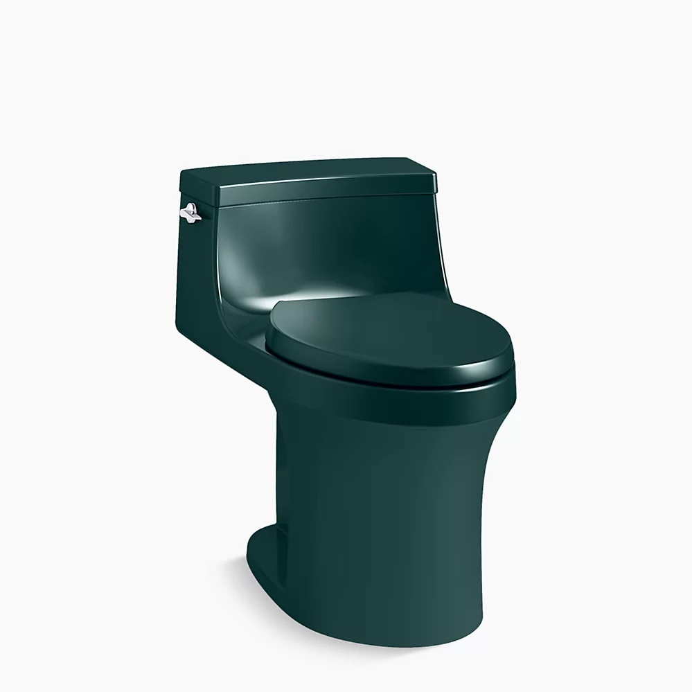
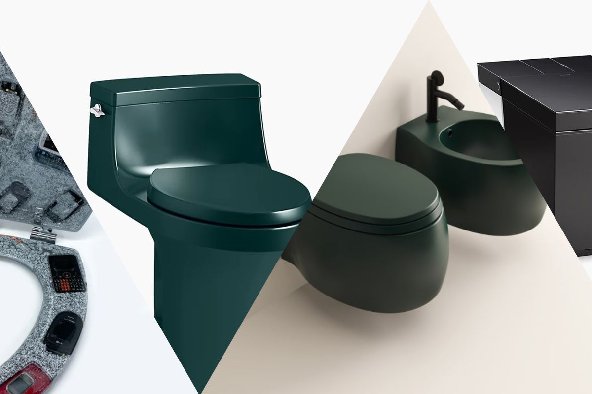
To commemorate their 150th anniversary, Kohler brought back colors from their past in 2023. They offered tubs, sinks, and toilets in Peachblow and Spring Green, two muted pastels similar to those you could find in a bathroom with colorful vintage tiling. For 2024, they rooted around in the archives and reissued three greens: Aspen Green, an on-trend, soft sage; Teal, a dark and moody blackened green; and Fresh Green, an almost-avocado hue that suggests the eternal optimism of spring.
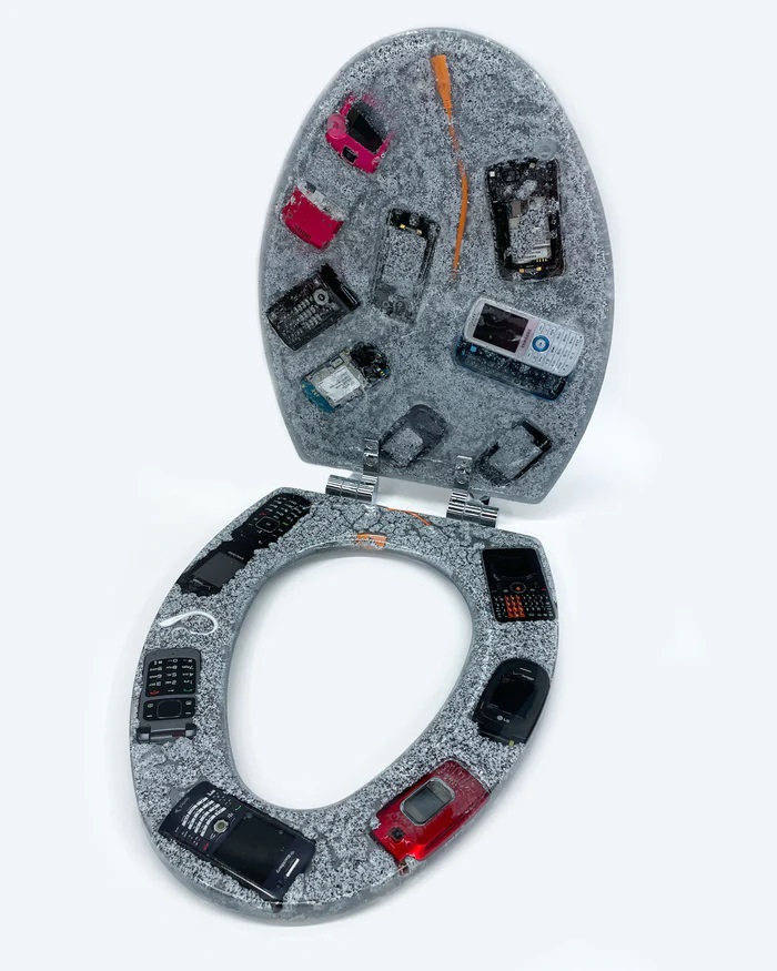
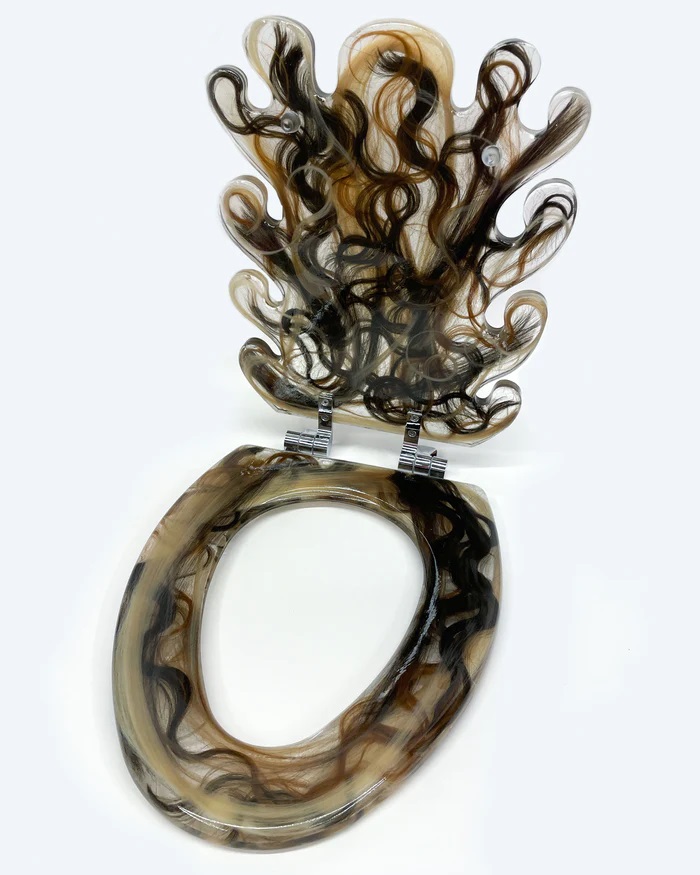
You might have come across Bailey Hikawa’s 3D phone cases if you’ve been on Instagram for any length of time. Her newest obsession has been with toilets—resin seats covered in hair and cell phones from the year 2000. If you’re not comfortable remodeling your entire bathroom to accommodate a dark-colored toilet, think about going with a minimalist bathroom with a maximalist toilet seat as a simple way to embrace the ridiculousness of the piece itself.
Hikawa’s recent forays would feel at home in an industrial bathroom in a cafe serving adaptogen-infused lattes; there’s a nasty and subversive quality to her creations that begs the user to linger.
If the toilet is usually white porcelain and has no other color, texture, or finish, it feels especially impractical. Perhaps this is a sign that we’re moving away from the staid and toward an aesthetic that’s a little more playful and, dare I say, practical. It’s never fun to clean a bathroom. These manufacturers appear to be arguing that if your home expresses your personality in so many other ways, your bathroom ought to as well.
Toto and other Japanese toilet manufacturers are notoriously luxurious because they provide customers the feeling of a true spa experience right in the comfort of their own home. Even though they have a generally pleasing appearance, they have a cold, sterile feel that conveys utility rather than fun. While Toto’s high-end products may seem to be the pinnacle of toilet innovation, several brands recently introduced choices that truly combine style and functionality.
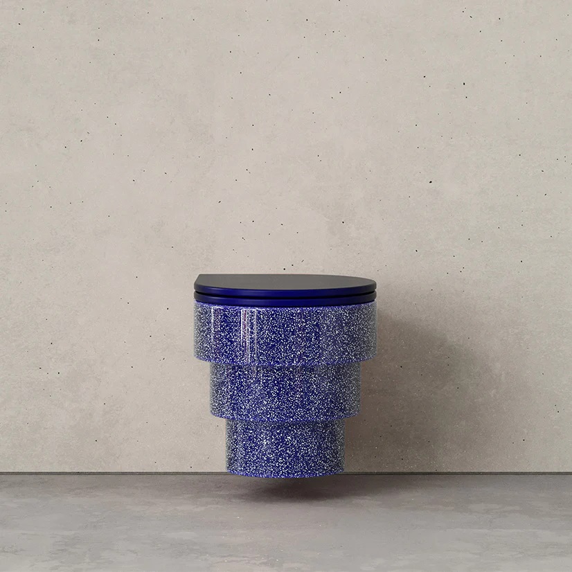
Just three items are available from the French bathroom brand Trone: two wall-mounted toilets and a matching wall-mounted plate that regulates the flush. Released in 2021, Callipyge is exquisite enough to serve as the focal point of the bathroom while having a slight resemblance to the Guggenheim. The toilet bowl is rimless, but it doesn’t have the bidet features that Toto and other high-end models have. In a traditional toilet, water flushes from under the bowl’s lip when you flush, but in a rimless model, the water flushes horizontally along the sides, making cleaning easier.
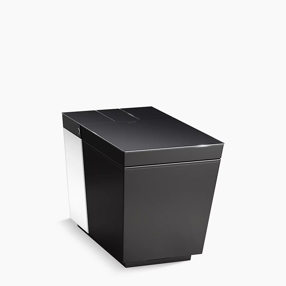
With the Numi 2.0, for example, which has a slight resemblance to a nice garbage can and is equipped with all the expected bells and whistles—LED lights, warm air blasting on your nether regions, temperature-controlled water in a bidet function that cleans both your front and back—Kohler has also taken this on. Perhaps most important, though, is integration with Alexa.
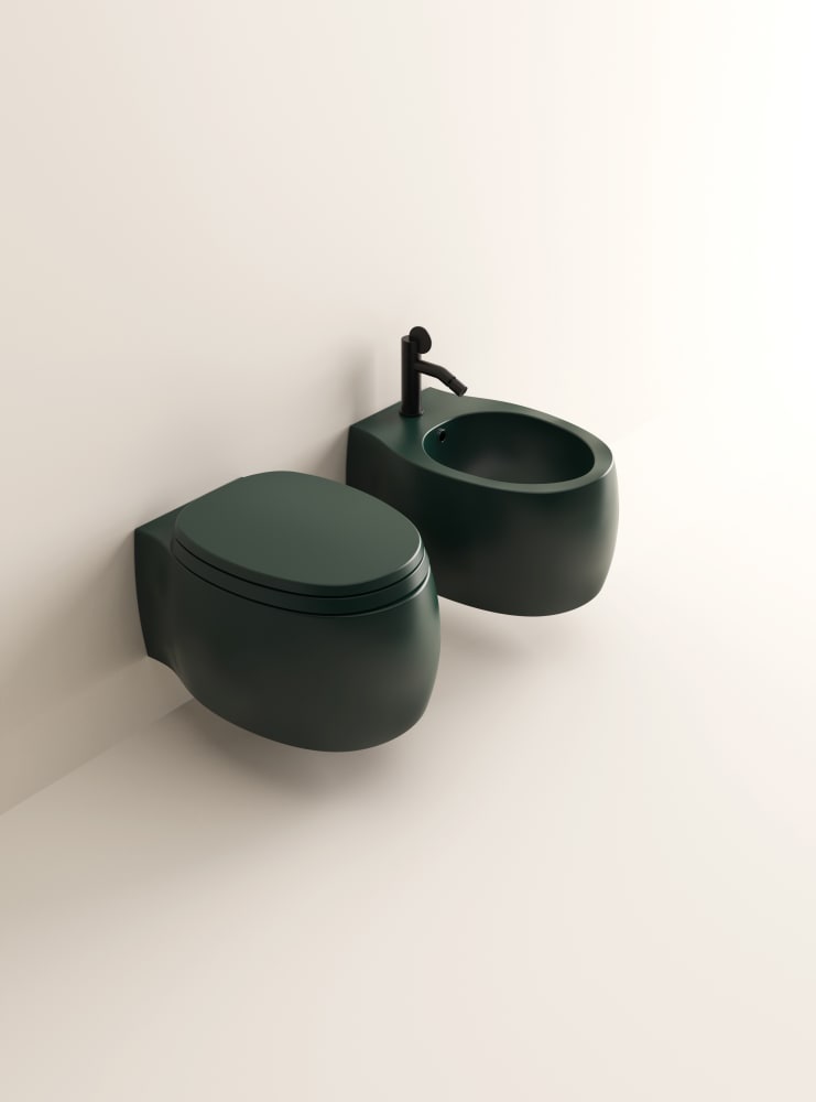
Then there are the companies that combine style and elegance. Agape Design, an Italian sanitaryware brand, features work from designers such as Studiopepe, Angelo Mangioratti, and Patricia Uriquola, whose 2015 Shimmer Table for Glas Italia has now been copied to the point of feeling ubiquitous. Agape Design treats sinks and toilets with the same thoughtful consideration one might give a kitchen or a primary suite. Pears 2, the 2019 toilet she created for Agape, has a rather conventional appearance to reduce confusion in the bathroom, but it sticks out because of its striking hue and simple lines.
Although Agape and Trone’s European minimalism is one direction the bathroom has gone, plenty of individuals are experimenting with kitsch as well.
It’s noteworthy that while so much innovation of private space is happening in private homes, we’ve stalled out on the private ones in public spaces The idea behind the development of a project such as the Tokyo Toilet Project is more similar to the choice of toilet you might make for your home than it might initially seem. That is, everyone should be able to find some beauty in the ordinary, because only then can we break up the monotony of a typical, everyday life.
